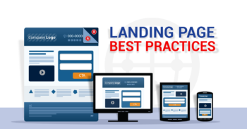
Landing pages are fantastic for promoting specific products and services. But how exactly does a landing page differ from your usual website and how can you best utilise it to maximise revenue and customer engagement?

What is a Landing Page
A landing page is a stand-out page made especially for a specific marketing campaign. When launching a product or service, your landing page is the first thing a customer will see. If you are promoting more than one product or service, you should have more than one landing page.
What Makes a Good Landing Page?
Whether you’re selling homemade candles, advertising a mid-season sofa sale or promoting a Diploma of Practice Management course, your landing page needs to be simple, clear and engaging.
So what are the specific secrets to a successful landing page?
- Stay On Topic
As we already mentioned, a landing page needs to specific to the particular product or service you are promoting. Keep all the information on-point and relevant. Your general website can cover all sorts of other information about the company and other services you provide but your landing page should be about one thing and one thing only.
- Tailor Made Is Always The Best Fit
Don’t be afraid to create separate landing pages for different target audiences.
A customer who is accessing your landing page from Facebook or Instagram may differ greatly to the type of customer who would find your page via an email newsletter. You may be selling the same product to both types of customers but the way you sell that product may differ depending on the demographic.
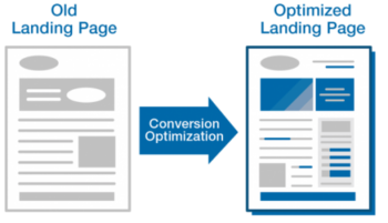
Creating separate landing pages will allow you to directly target certain types of customers and sell the product by identifying their specific needs and preferences. This will ultimately improve your conversion rates and increase sales.
 Image Source: iblogzone.com
- Keep it Simple
Although you want to grab your customers’ attention, don’t overwhelm them with too much information or crazy designs. Keep the landing page simple and user-friendly. You want to make it clear and easy to navigate.
- Be Mobile
There are now 5 billion mobile users worldwide. You only need to look up on the bus or train on your morning commute to notice how everyone is glued to their smartphones for significant amounts of time per day. Making the mobile version of your landing page as functional and engaging as possible is, therefore, key to its success.
Furthermore, Google’s official roll-out of mobile first indexing was announced in March 2018. This means that mobile sites now actually rank hire on search engines than desktop versions. So in order for your landing page to appear on google searches and reach your potential customers, you need to make sure it is mobile friendly.
- Showcase Your Products
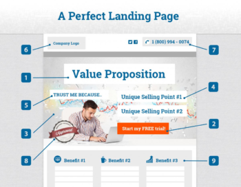
Your landing page is your elevator pitch, your one chance to show off your product or service. Write descriptive product displays and use images to attract attention. Make the site colourful and attractive but keep it tasteful and easy to see. A video is also a great way to engage users but keep it simple and don’t overwhelm site visitors with too much moving imagery – less is definitely more.
- Clear Call To Action
Having a great looking landing page is one thing but if it doesn’t convert the visitor in some way, then it has failed.
Not all landing pages will have the same objective. Some will be about getting customers to sign up for a free trial, some may want to encourage people to purchase certain products and others may be about getting people to join a mailing list.
Whatever you want your site visitors to do, make sure the objective is clear with a call to action buttons like “FIND OUT MORE” or “BUY NOW” linking customers to the relevant pages to take the next step. These are key to converting visitors into customers. Make sure your call to action buttons are located in easy-to-see places and that the font is easy to read in a clear colour. You can have more than one position for your call to action button if you wish but don’t over-do it.

Image Source: dhamma4u.com
- Make It Easy
If your landing page is as effective as it could and should be, many users will likely click on the call to action button which links to the next step in the process. Whether that’s to sign them up to a newsletter or to buy a specific product, you need to make the next step as simple and straightforward as possible.
If the application or payment form is too complicated, slow to load or is asking for too much unnecessary information, customers are likely to abandon the process. Losing your customers at this stage will make even the best landing page of all time completely redundant. Keep your customers and ensure the sales cycle is complete by making this step as easy as possible.
Conclusion
Landing pages are a great way to introduce customers to a new product or service. The best landing pages have a clear objective and are simple and easy to use. Make your landing page attractive and engaging but don’t overwhelm users with too much information.

