When creating an appealing design, it is crucial to put yourself in the user’s shoes in order to create an easy-to-use and smart design so that the user can effortlessly navigate through the website. In some cases, websites are constantly thriving with new content and information, usually at the expense of style. Therefore, if you are dealing with a content heavy website, there are many ways to boost the user experience design and still preserve the essential content of the web page.
Here are some simple UX guidelines for content heavy UI that you can try:
Create an outline of the webpage
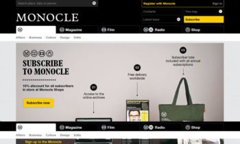
First of all, give a thought to the outline of the page i.e. its structure. When you are starting from scratch, consider the content that you want your users to notice first. You want them to scan only the essential information and you shall put this at the top left side as well as at the bottom. With headings or navigation bar’s indications, the users can get an idea how the web page operates. A good example is andysowards blog, with everything clearly outlined ‘above the fold’. Moreover, with a clear idea of the way it is organized, the users can quickly proceed to the content that interests them the most.

image source: https://speckyboy.com/wp-content/uploads/2013/05/content_heavy_01.jpg
Declutter the page
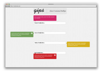
Many details on a page shall eventually result in clutter. In order to avoid this scenario, but preserve the valuable content, consider using tooltips. Try to cut a long text by taking advantage of the ellipses.They can hide the text at the beginning or at the end but still provide it when needed. Another way to declutter your page is by simply using filter or search option that will enable an easy browsing through the content. In addition, autosuggest can come in handy as well.

image source:
Make the page actionable
Your user needs to easily understand which elements on the page are clickable so they don’t get mixed with other static elements on the page. Therefore, any clickable image, text or icons should be different from the rest. For example, make dimensional call-to-action buttons so the user would notice that they are clickable. Another way is to change the content on hover, to be more precise to change its styling. Moreover, If the user is dealing with editable content like a form, some feedback should be given as to know if the form is submitted or not.

image source:
Keep it simple
Keep it simple as not to overwhelm the users. Too much content or a pull-down menu on the front page can make the users leave without going through the content. Avoid this by keeping your website well-organized. Enable a simple navigation by introducing main structure like a tiled layout containing titles as well as minimal subtext. However, it’s hard to achieve a perfect balance with heavy content, because it often results in poor design. Avoid sacrificing the aesthetics by consulting a professional, for example Bapple ecommerce website design. With the expert’s sharp eye, there is no need to sacrifice any aspect of your website.
Visual elements
Instead of smothering your users with heavy content, consider wooing them with some attractive visual elements. Start with photos. For example photo collage with links on the website will attract the users and still provide enough information. Draw attention to certain parts of the content with animation. If you feel that this creates too much clutter for your website, you can always put up some monochrome backgrounds and simple graphics. Moreover, you can combine some photo links with smaller pieces of news on the side as to emphasize the most important information.

image source: https://usabilitygeek.com/wp-content/uploads/2016/05/designing-content-heavy-websites-house.jpg
Avoid users’ mistakes
When it comes to users’ mistakes, you should plan ahead. As already mentioned, tooltips in UI design are used to avoid clutter, but they also prevent mistakes from happening. By adding more content around icons or other elements, the users are less likely to make a mistake. This rule doesn’t only go for icons, but also for any action item. For example, pop-ups with detailed texts explaining the actions to the users can come in handy. Furthermore, failsafe pop-ups give them a heads-up in case of a mistake. If they fail to fill in the form or delete a file, they will be warned about it.
Put yourself in the visitors’ shoes
As you can see, there is no need for any aspect of your website to suffer. Naturally, handling a content heavy UI has its certain design obstacles, but you should not leave your visitors hungry for content. Instead of being torn between smart design and content, make the best of both by following these simple UX guidelines. Keep the web page organized, clutter free and actionable yet simple. Not only is this pertinent for your website, it is also crucial when it comes to app design. Put yourself in the visitors’ shoes as to avoid users’ mistakes. Attract your visitors with captivating visual elements so they could later easily explore the thriving content of your website.

