
When it comes to optimizing a website, one of the most important issues is site navigation. This element plays one of the most important roles in directing a customer to the product he or she is likely to be interested in. Good site navigation can improve customer experience, leading to the larger amount of sales for your business.
When working on a new website design, you should consider different UI patterns, rules, business preferences and corporate branding. A well-designed website should illustrate the store’s personal touch and make the process of finding and buying products as convenient as possible.
This article is going to list our 7 ideas on improving site navigation on a typical ecommerce site. Moreover, we are going to discuss an instrument which you can see to make the product searching both faster and easier.
Use labels that are easy to distinguish
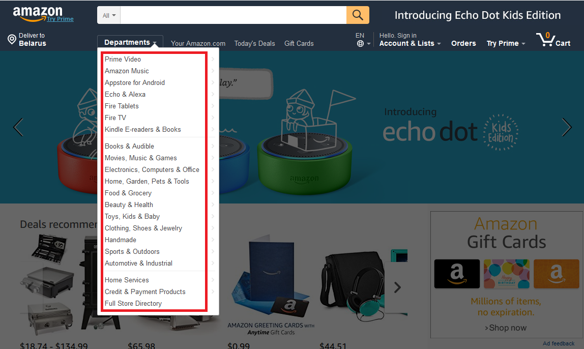
A well-thought-out site navigation should contain product category labels that are easy to distinguish. They may be represented by special symbols or names describing the nature of the particular category they have been made for.
One good example to consider is amazon.com. The names of the sections shown below give users a short and yet concise description of the products they contain.
Make navigational elements clickable
Many website designers neglect the convenience of using drop-down navigational elements and fly out menus. This decision may make sense on a small site with just a few sections. But the absence of drop-down menus on a large ecommerce shop will certainly hurt its usability and navigation.
One of the ideas for creating good navigational elements is to make the top level navigation labels work as links to a particular product page.
Back in 2013, the Baymard Institute published their study about the visitor’s experience by using home and category pages on the different ECommerce sites. One of the interesting results they’ve confirmed is the fact that a typical visitor would prefer the top pages of a drop-down or fly out the menu to be used as navigational links.
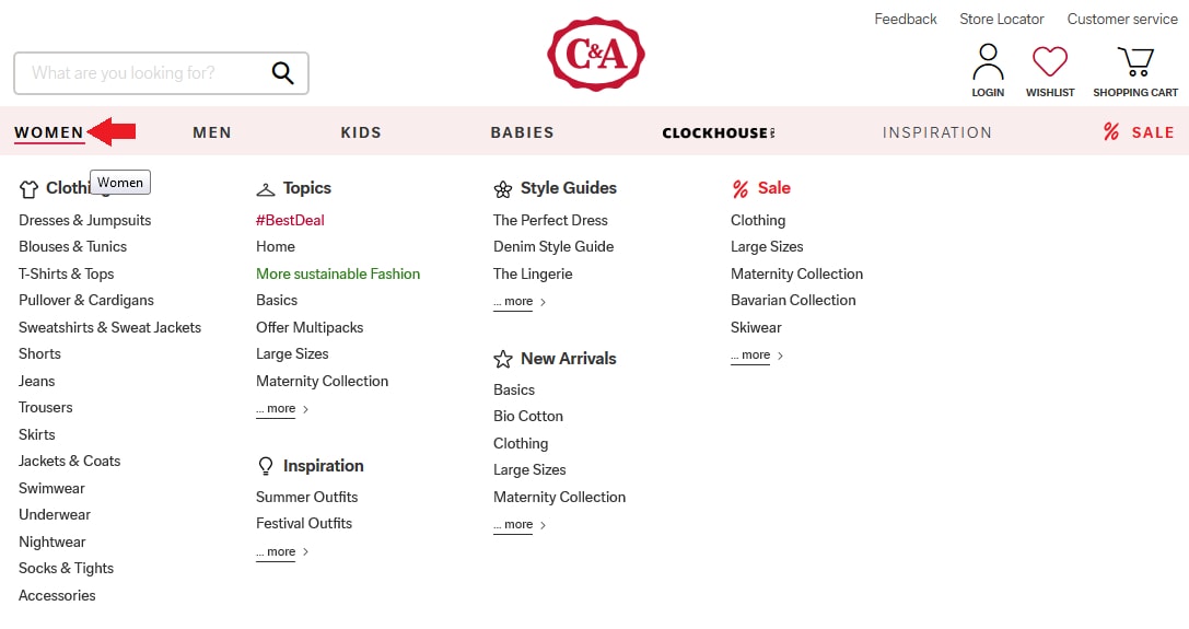
The top-level navigation labels of c-and-a.com can be used to get to the different product sections with just a few clicks of the mouse. For example, clicking the “Woman” section will redirect users to the respective section. Same goes for “Men”, “Kids” and other navigational elements.
Design a website according to the common web standards
Although it might be tempting to set up a unique design for your brand new site, many web designers often suggest going for the classical one.
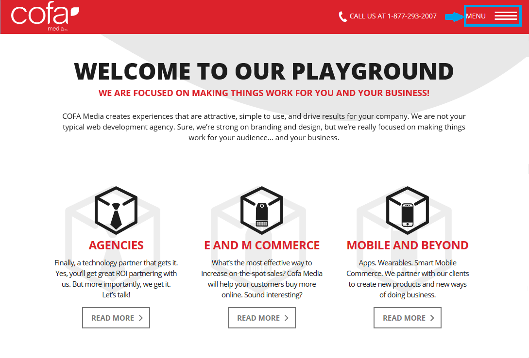
When you are in the process of creating a website, we suggest locating the main navigational elements either on top or on the left side of the page. If you are also planning to develop its mobile-friendly version, consider hidden menus since they will be making the interface look cleaner and user-friendly.
Below we present two good examples of how classical navigational elements may look like.
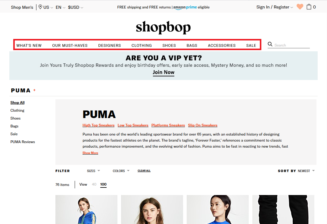
First up, is the website of US online fashion apparel shopbop.com which features long navigation bar at the top of the page with the names of its main sections.
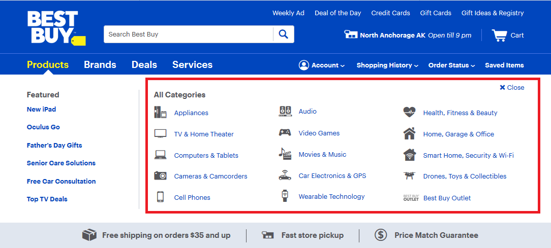
Next up is bestbuy.com, an American multinational consumer electronics corporation. This web resource uses hover navigation elements.
Finally, a good example of using hidden menus is cofamedia.com, the website of the respective web design company:
Implement site search feature
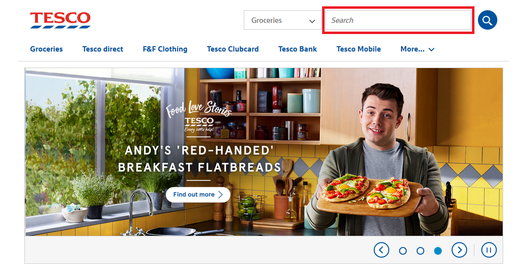
Website searching is a must-have feature for a modern ecommerce website. Not only can the save a lot of time but also improve the user experience.
The official website of Tesco, the British multinational groceries and general merchandise retailer has a large and cleverly placed a search bar which is visible from every single page:
Highlight sales and discounts
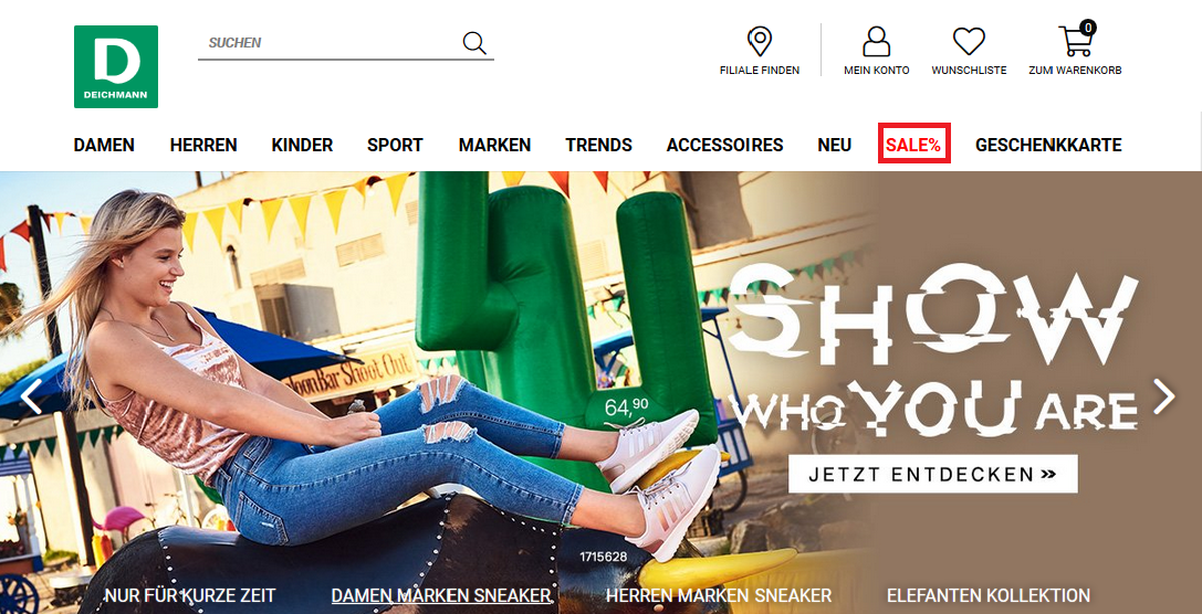
Special offers located on your site’s global navigation bar are bound to catch customers’ attention.
Going to deichmann.com, you will find the “Sale%” section. Hovering your mouse across that category will display a list of respective product subsections.
Include product descriptions
Informative product description can also be beneficial for your site navigation. Customers will be more motivated to buy if your product pages are accompanied by an informative and well-structured description.
Use extensions to make product searching easier
Last but not the least important element of your website navigation is the product search function. Advanced product filtering will allow users to search for the specific product with unique attributes. This will help site owners improve customer’s shopping experience and bring a large number of sales for themselves.
If you are looking for a quick solution to provide your customers with detailed product search capabilities, take a look at some of the modern Adobe Commerce Layered Navigation extensions available online. They are easy to implement and use.
Conclusion
Having well-organized navigation is one of the most essential ingredients for your website’s success. Investing enough time and effort into designing its main elements will result in additional sales and increased revenue.
Below is the summary of our 7 ideas on how to improve the navigation of a typical commerce site:
- Use labels that are easy to distinguish;
- Make navigational elements clickable;
- Design a website according to the common web standards;
- Implement the site search feature;
- Highlight sales and discounts;
- Include product descriptions;
- Use extensions to make product searching easier.

