What’s the most important element in driving conversions on your ecommerce store? User experience. You may have million dollar ad budgets, the best product in the market, and even the best ecommerce platform, but if your store doesn’t offer a good user experience, it won’t convert. You have only a few seconds to lure visitors into checking out what you have to offer. UX is largely dependent on design and functionality. What does good ecommerce design look like? Well- here are 50 examples of stellar ecommerce design:
1. Hyphen
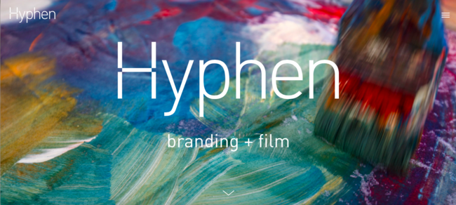
Hyphen exhibits a high level of contrast between the vibrant photos and the sleek design. A hyphen is used is join two words together, and similarly, this site is bringing together various aspects to make one product. It is interactive and easy to navigate. The background image makes the overall site attractive and draws in users.
2. Native Union
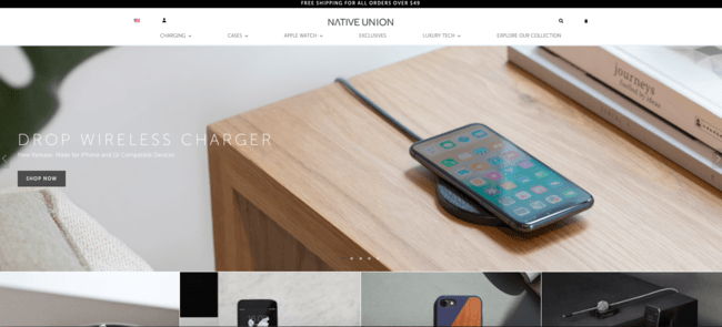
The sliding banner makes the website interactive for the user and easy to navigate to the different pages. The use of images throughout the site is more engaging than text alone and better represents the products. Photos of the products are front and center leaving the user with fewer questions.
3. Vans
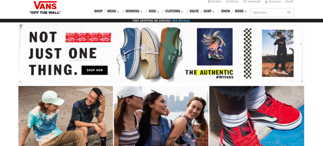
Vans is a very special and iconic brand as is the website. The contrast, fonts, lines, images, and spacing represent the brand’s story. The site uses all kinds of digital media content ultimately making it feel less like a store and more like a community.
4. Human Solution
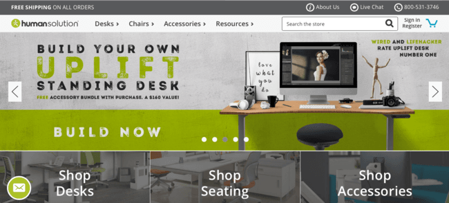
As soon as the Human Solutions site opens it is clear what the product and message are. The navigation bar, slider, and buttons are designed with various fonts which makes the website attractive and stylish. Every aspect of the site serves a distinct purpose making it extremely user-friendly.
5. Annesley Surfboards
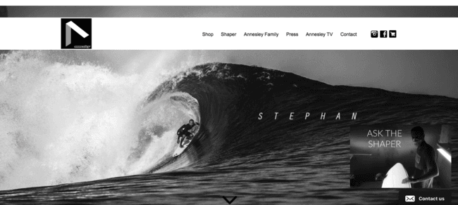
The site uses large and attractive photos on the homepage to instantly attract the user. The text is written in small bold script making it visible but not overpowering. Overall the entire interface is very aesthetically pleasing. Just one visit to the Annesley Surfboards website and you will be heading for the waves.
6. Beatific
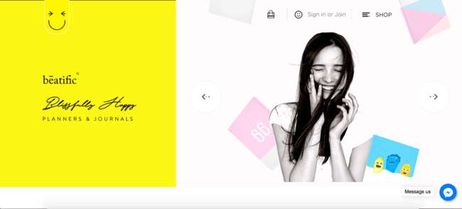
Beatific uses a wide variety of digital content such as photos, animations, and illustrations to successfully convey its message. The color scheme and fonts create a young and playful brand that is evident throughout the entire site. It’s just a fun site to be on and brings a smile to your face.
7. Bulk Nutrients
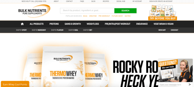
The mega drop-down menu at the top of the site is clear and organized. The color scheme matches the product and works together to create a clear and concise message. The message is bold and powerful, perfect for a supplement company.
8. Diamond Exchange
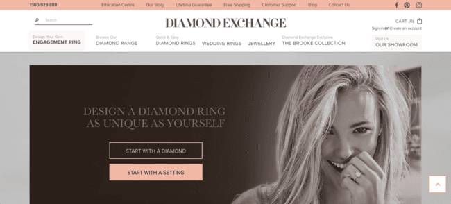
The Diamond Exchange primarily serves women as do the colors and photos used throughout the site. Everything is clearly organized with the proper colors and fonts. The entire site flows easily. A diamond really is a girl’s best friend.
9. Everything ORGO
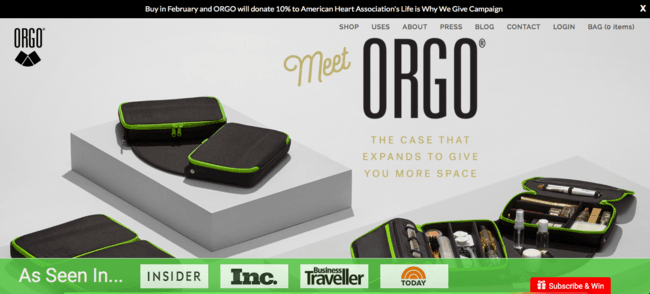
Everything ORGO features both a stagnant photo and scrolling screen giving it a special fit and flare vibe. The product is the focus without being overbearing. The design is unique and special tailor-made for the company.
10. Carolina Herrera
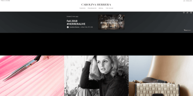
From its multi-level navigation bar on the top of the site to high visual appeal, Carolina Herrera uses a mixture of basic and modern tools to create an appealing webpage. It exhibits a small sidebar menu which greatly enhances the browsing experience. Carolina Herrera is a fashion company which is clearly shown on the website.
11. X-Doria
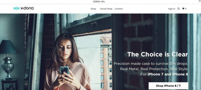
The well thought out navigation, search and filtering design is essential, and X-Doria has an excellent design showcasing these aspects. It has a common and appropriate design while maintaining a pleasing aesthetic.
12. Bellroy
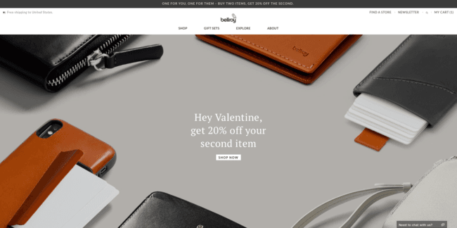
This site maintains the traditional and simple layout but adds in other creative touches to make it stand out. The illustrations, presentation videos, and pops of color set it apart. The website is both sleek and stylish similar to the leather products. The bright site colors contrast the neutral product colors.
13. ETQ Amsterdam
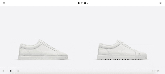
ETQ Amsterdam has a knockout design making is different than anything else. It incorporates a full on modern and minimalist style. The site follows suit with the brands core values of Elegance and Quality.
14. Best Made Company
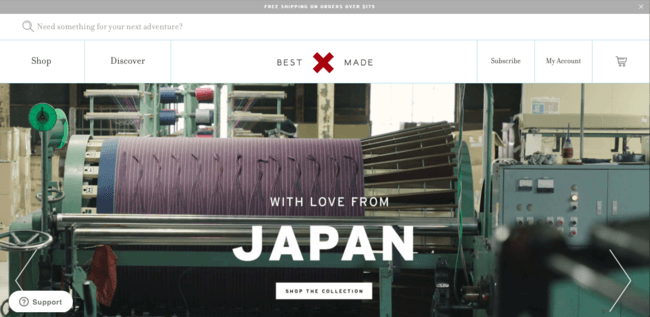
The navigation bar on the top of the site is creative and easily recognizable. The interface has one common design creating a sense of synergy throughout the fonts, images, and menus. The menu isn’t just at the top of the page but follows along as the user scrolls.
15. Shwood
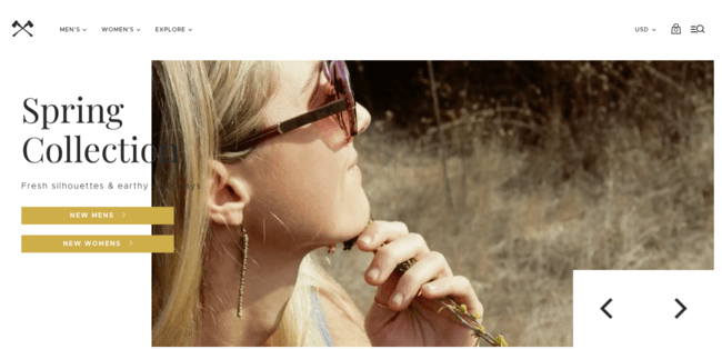
Shwood is a typical website but uses stunning photos to set it apart. The neutral color scheme and imagery help bring value to the product and keeps user retention high. The sunglasses and website are both handcrafted to perfection.
16. Little Tree Shoes
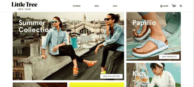
Little Tree Shoes has a fun geometric design complimented by vibrant images. The entire site is organized with purpose and easy to navigate. The user’s eye easily moves from one thing to the next.
17. My Magic Mud
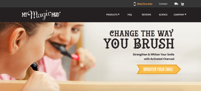
The people used in the images are communicating nonverbal messages that draw in the user and support the message. My Magic Mud uses creative fonts and graphics to make the brand stand out. The site incorporates fun infographics and background designs to set it apart.
18. Nektar De Stagni
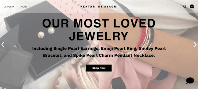
Nektar De Stagni’s offers a minimalistic design focused on the product and isn’t cluttered with menus, dropdowns, or information. Every button and photo is placed with purpose and beautifully done. The jewelry is the main focus of the site and text only pops up when the user is looking for it.
19. Onchek
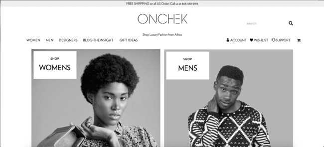
The homepage is perfectly designed to draw the user in but forces the user to dig deeper to find the products and information. The two large home photos showcase the company and are just as pleasing to look at. The homepage is beautifully black and white, but as you dig deeper into the site the colors start to come out.
20. Wabi Cycles
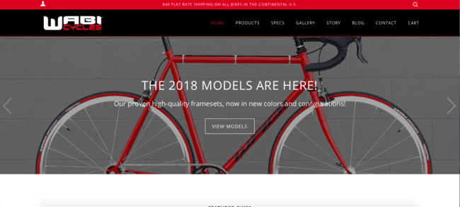
Wabi Cycles sports the traditional drop-down menu but also jumps right into their product and mission right on the home page. The homepage slider clearly exemplifies the companies three main messages. The bikes are stunning and speak for themselves.
21. Pink Lily Boutique
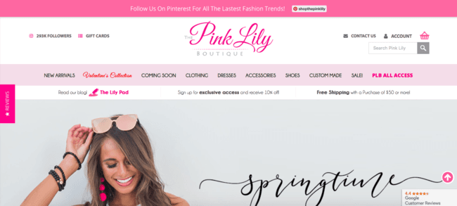
Pink Lily’s webpage flows and reads like a fashion magazine which caters directly to its desired audience. It makes you want to keep scrolling to see all the new trends. Every drop down, button, and page is accompanied by a photo which ultimately drives sales.
22. Serengetee
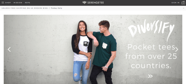
Serengetee’s mission is to support artisans and causes around the world and that message is conveyed throughout the entire site. It is scattered with eye-catching travel photos and minimalistic details. Overall it’s just a feel-good website.
23. Solo Stove
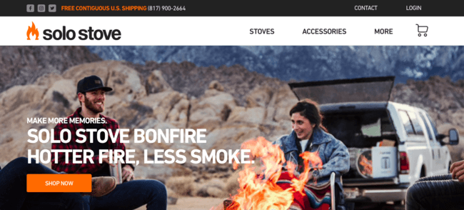
As soon as the user opens the Solo Stove website the mind is already seeking to learn more. The home page draws you in and keeps you close. The important information is in plain sight and easy to navigate. The site makes the user feel like everyone is made to be in the mountains.
24. Makr
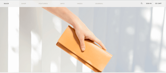
The landing page is specific to Makr yet interactive to the user. It features rows of different leather products that change color as the user hovers over them. This not only showcases the different products and colors but sparks interest.
25. Buffy Comforters
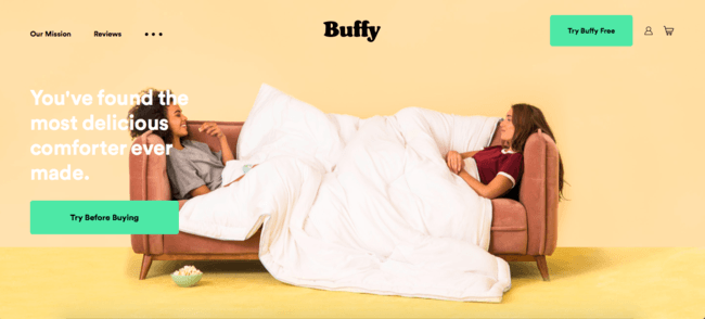
The background photo makes the user want to jump right on that couch and snuggle under the Buffy comforter. Buffy claims they are the fluffiest, softest, and lightest comforter ever and the website makes it more than believable. It sells the product effortlessly.
26. Krewe
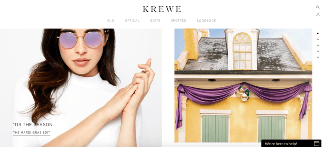
The homepage does not scroll like a normal website but instead uses a vertical slider. The various slides use bright images and videos to captivate the user. Krewe promotes a type of lifestyle that is seemingly achievable by purchasing a pair of sunglasses.
27. ROC
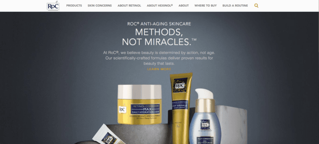
The ROC webpage looks and feels like a sleek and professional advertisement and it completely works for them. It is not overbearing, but at the same time not confusing. It is designed with the middle-aged woman in mind which makes the user-friendly feel even more important.
28. DSTLD
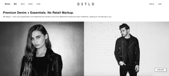
DSTLD believes less is more not only in their clothes but on their website. Everything and anything the user may need is just one click away. The whole embodiment of the company really shines through on the site.
29. TIINA – The STORE
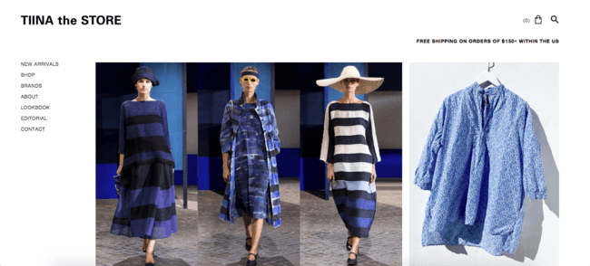
Who is Tinna and why does she have a store? We don’t know, but we do know we want to be apart of it. Well, actually we do know because the website explains it all in the about section. The website is as unique as the founder Tiina Laakkonen.
30. Milk Makeup
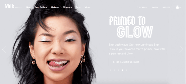
Oh, you thought milk was just for drinking, well turns out it’s actually a multi-use, cruelty-free makeup brand. Still confused? Everything is beautifully explained and depicted on Milk’s user-friendly website.
31. Blok Knives
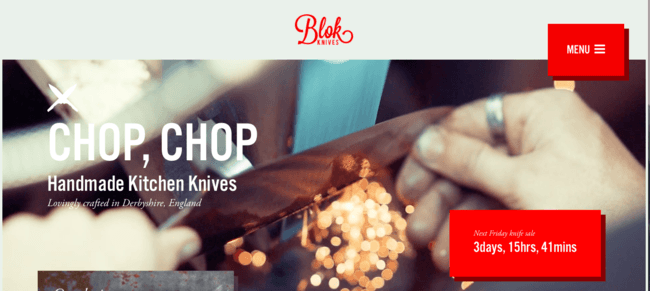
Blok Knives is chopping its way not only through the utensil world but also the website world. The site’s homepage exhibits a fresh collage design and is so pretty it almost makes you forget you’re shopping for knives.
32. Where Mountains Meet
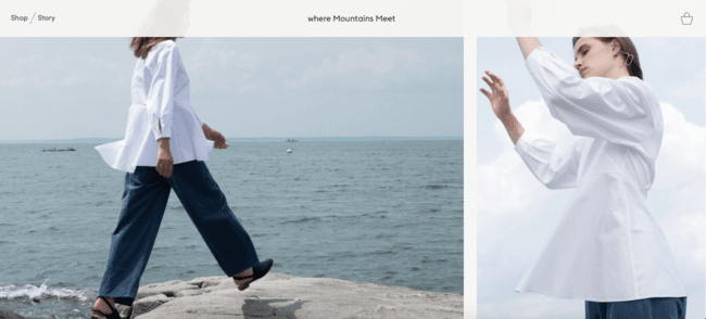
Where Mountains Meet’s webpage is as stylish and simple as their clothes. They ditched the tradition drop-down menus for a more creative look. Finding the desired landing pages is like a fun little scavenger hunt you actually want to go on.
33. Two Chimps Coffee
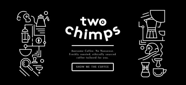
The brand’s uniqueness shines through as Two Chimps number one priority. The hamburger menu has a rare design and pop up. The entire site is full of distinct feature and app integrations that offer a unique and memorable experience for users.
34. Grovemade
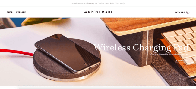
At Grovemade they believe that design inspires what you do and their website design is following suit. The site’s design gives the user the options to either shop or explore. It is simple and to the point all while making the user feel warm and fuzzy on the inside.
35. Sperry
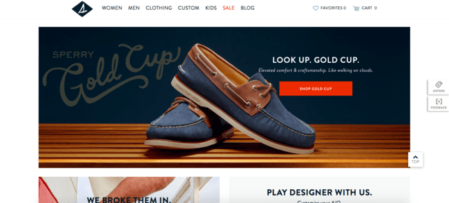
Sperry is remaking history with the same clean look as the 1935 iconic shoe likewise their site exhibits the same iconic and clean look. It features photos, videos, and witty phrases to really draw in the user. The website is a breeze to walk through and Sperry is always there to help.
36. Nuyu
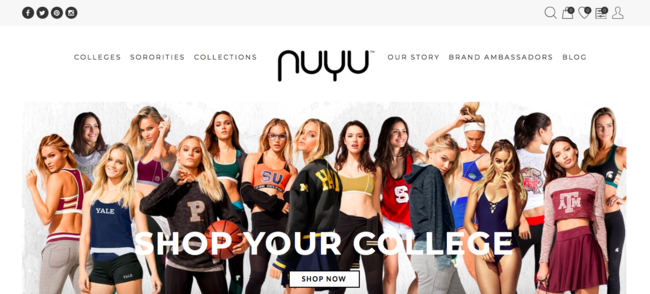
Nuyu is simple yet flashy all at the same time. It is clear that the site is directly targeted at college-aged females. Shopping at Nuyu means more than just buying a new jacket, it’s about being a part of something and that’s clear from the very first click.
37. CamelBak
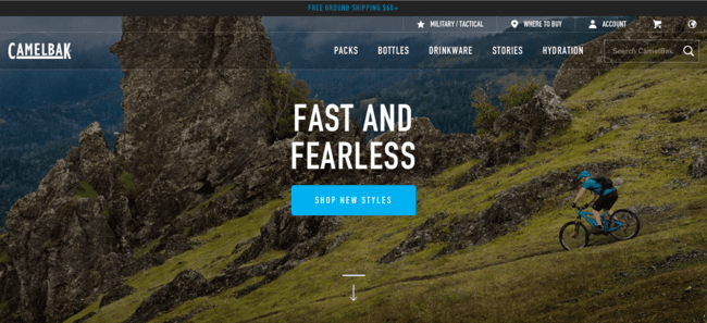
The Camelbak site transforms as the user scrolls drawing the user in more and more. As the user scrolls below the fold the top drop-down menu disappears and the products are beautifully displayed. The user doesn’t even have to leave the homepage to know what the company is all about.
38. Faena Hotels
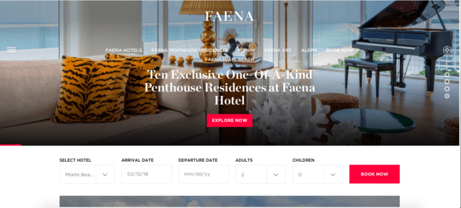
Faena is a hospitality website through and through, but what makes it unique are the vibrant photos and fascinating articles. They don’t just want you to book a hotel, but an experience. The typical booking menu is there, but it’s not obnoxiously the focal point.
39. Flambette
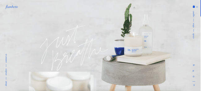
Scrolling through the Flambette website is relaxing and seamless. The color scheme is warm and inviting. If the website alone can remind the user to just breathe imagine what the actual products could do.
40. LivSo
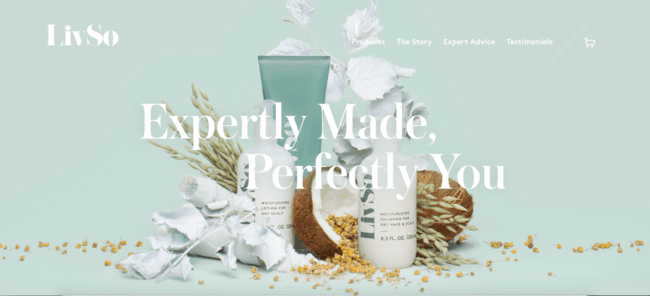
The website is aesthetically pleasing and easy to soak in as the user. It exemplifies gorgeous fonts and unique design details. Not a single aspect went unnoticed and everything works together to create a stand-out site.
41. HashtagBay
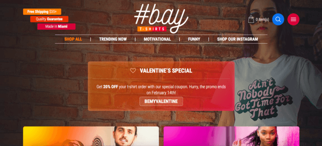
There are very few things as millennial as the hashtag, but ironically this site may just fit the criteria. It’s trending and bright, but not sloppy. It’s fun to look at and every page is like a new discovery.
42. Di Bruno
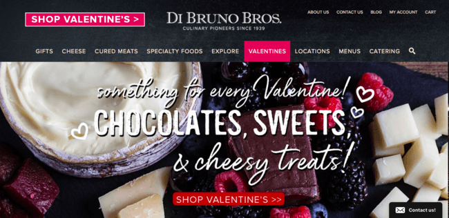
Gourmet food is meant to be beautiful and fancy and this website compliments just that. It’s profession and sleek, yet fun and innovative. The slider, photos, and fonts are all part of the Di Bruno brand.
43. SISU Guard
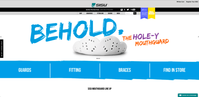
SISU takes a boring old mouth guard and makes it exciting. The website uses fun features and beautiful designs to make buying a mouth guard seem like a day at the beach. The fonts and colors are young and fresh.
44. Sierra Designs
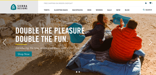
Scrolling through the Sierra Designs website makes the user feel like they are already out in nature and not staring at a computer screen. The beautiful mountain scenes and color schemes demonstrate the adventure spirit of the company.
45. Boxhill
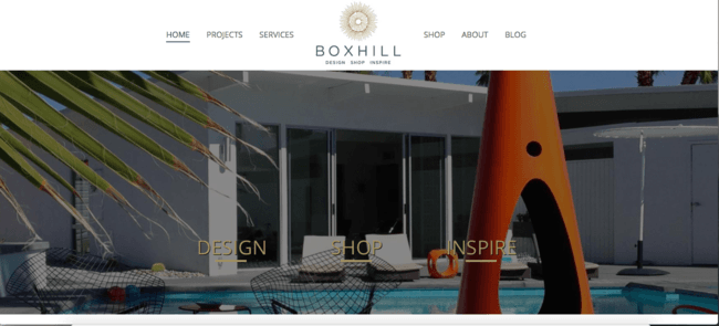
The Box Hill website is traditional but sprinkled with its own unique features. Everything is perfectly coordinated to create an easygoing yet professional design. The fun illustrations remind the user of Box Hill’s mission and purpose.
46. Berkey Water
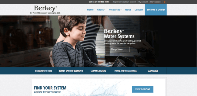
There is no mistaking that Berkey is a water company from its blue color scheme to its eco-friendly undertones. Every aspect of the site matches the purpose of the company. It perfectly executes the use of facts and figures.
47. Phone Jacks
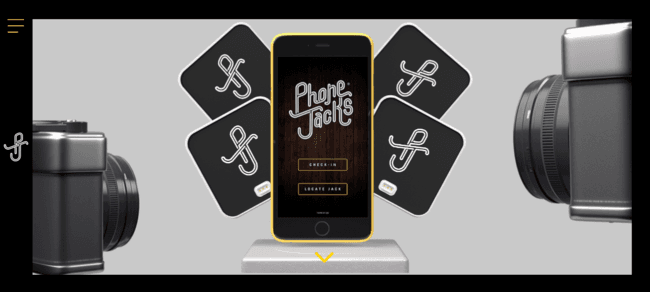
There is a new surprise around every corner of the Phone Jacks website. It puts the product on display and lets the user’s imagination fill in the rest. It’s beautifully executed and well thought out. It is filled with various different multimedia aspects that really bring it all together.
48. Carbon Beauty
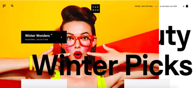
Carbon Beauty uses a fun overlapping technique as the user begins to scroll through the site. It is captivating and intriguing. The products seem to bounce right off the screen. The overlapping theme is carried on throughout the entire site.
49. Spectre Wireless
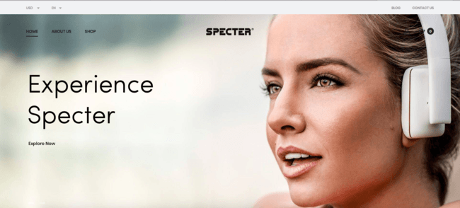
The minimalistic design of the website matches the same excellent design as the products. The colors are simple yet seem to pop out at the user. Every aspect of the site seems to be well thought out and intentional.
50. P&co
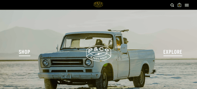
The best part about this site is the intentional use of white space or more importantly the lack thereof. Every inch of the site is covered with photos, colors, and words. Not a single spot was left untouched.
Feeling inspired?
These are just a few of the many ecommerce stores out there that offer great user experience through beautiful design. Here’s a curated gallery of even more stores with beautiful designs.
Have you come across any ecommerce stores with designs that caught your eye? Share them in the comments below!


