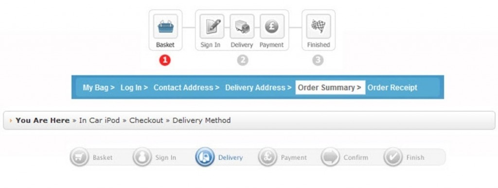
A clean, clear and simple navigation layout, with multiple navigation and product search options is the way to optimize usability—and consequently maximize sales.
Know your Customer.
If you do not know who your customer is, find out – and quick! We’ll discuss this in more detail shortly, but in order to maximize sales and conversions you need build your website specifically for your target customer.
Demographics & Psychographics.
This is simply about communicating to your audience effectively. Every personality type, every age group (within reason), every intelligence level and every internet experience level can land on your website. Have you considered building your website for the visually impaired, so they can easily navigate? How about providing how-to guides and help videos, to educate your users? These are just two simple examples to get you thinking.
Multiple Languages.
Offering multiple languages and selling globally can on average add 25% to your sales. This obviously depends on the product you are selling, and its suitability to be shipped overseas. However, having a global reach gives you and your customers a win-win situation.
Ask your web developer if they have a stable and reliable multi-Language module, and can you see it in action on a live site. Many branded ecommerce software solutions now come with this option. When testing on a live website, look for any text overflow in box headers, etc, as words can be longer when converted into other languages.
Google’s Free Website Translate Tool.
Google offer a Website Translator module that can be integrated into your site in minutes, by way of a simple piece of code. This will add a simple drop-down menu to your site, in your chosen location, and will provide your site users with approximately 50 different language conversions.
Note: Any text overflow present, when your default language is converted, is something you may just have to accept. So weigh up any negative effect of this text overflow versus the simplicity of using this module, and the extra sales you could get as a result of selling globally.
- Google Translate Tool: http://translate.google.com/translate_tools
How Google Translate Tool will look on your website
Trade Accounts.
By way of a simple trade application form on your website—similar to a contact form but with company details—you can offer trade customers a discount on products. Trade customers complete the form and their details are then stored in the ecommerce trade module, in your Content Management System (CMS) back-end, awaiting your approval. It’s all managed there.
Contact Forms.
As discussed in Step 1 (Sales & Support), using a clean and simple contact form is essential, so that would-be-customers can reach you easily. I prefer contact forms to displaying an actual email address on the live site, because spammers can get hold of your email address. If you add a CAPTCHA challenge response (security code) onto your contact form, any spam attempts are blocked.
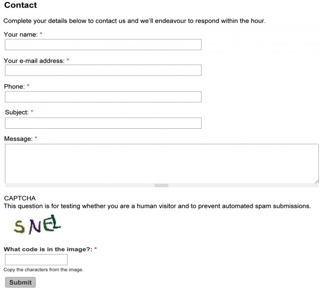
Example of a CAPTCHA Enabled Contact Form
Search Box.
All good ecommerce websites must have a search box option, as this is one of the first features a user will look for when entering your site and searching for products. More often than not, prospects will have arrived at your site direct from the Google search engine where they will have used the search box feature. So give them consistency and offer a search box.
Note: Test your search feature for accuracy of search results, before making your website live. If you give poor search results to your visitors—as many low-end ecommerce solutions do—you will deny your prospects and customers access to your product offerings and frustrate your site users.
- See Google’s Commerce Search for ideas: www.google.com/commercesearch/
Easy Navigation & Product Menus.
Finding products easily is down to using a clear hierarchy of product tiers, using text links or buttons to navigate from the home page down to the product pages. This clear structure is critical so your site user knows where to click to find the products they want. Use clean and uncluttered product menus and navigation bars. If you have a long product menu, split this into groups with a small heading per group so that it’s not one long—hard to read—menu.
Give Various navigation options so Customers can Easily Find Your products:
- Use a simple search box that scans your site content for matching keywords
- The header navigation bar can have a ‘Shop’ link/button linking to a page with all your product categories listed all on the one page
- Alternatively use a header navigation bar with a drop down menu displaying each main category or subcategory
- A left hand product menu can detail each product category or subcategory, using text or graphic headers for each and as in the paragraph above following a linear path to the products
- Taking navigation to its optimum level, a filter module giving the savvier net user a way to drill down through product attributes, to find specific products in seconds
- Thumbnail page (category or subcategory) will have sort features to filter by type, price, date, amount, or alphabetical order, and the ability to ascend & descend these options and a ‘View Items Per Page’
- Product promotions on your home page or left or right hand columns – for example Top 10 Best Sellers, New Arrivals, etc.
- You can position Best Sellers and New Arrivals in your main site header navigation bar for optimal prominence
- Footer Links provide quick access to specific categories or direct to specific best selling products (this is a good strategy for SEO too)
- Link to your products from your Blog, How-to Guides, Videos, etc.
In the example below, you will see that the silver menu in the center is made up of collapsible lists. When you click one of the main bold categories a list drops down to reveal the products within.
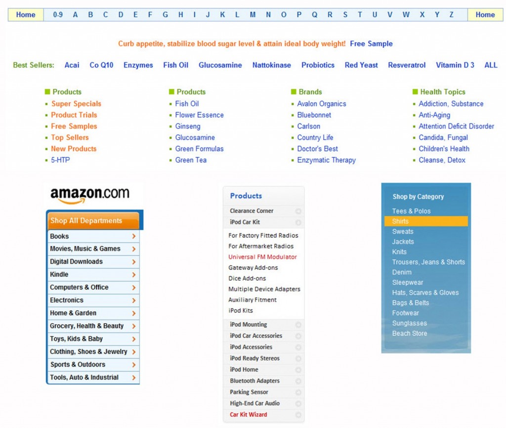
4 Examples of Easy to Read and Use Product Menus
Hot Tip: A clear and simple tiered navigation, with the least steps as possible, not only helps your user, but also allows Google spiders to crawl and index your website with ease. Text links are better for Google than image buttons, and if you do have to use image buttons, accompany these with a text link or use your left menu as text links. Alternatively add an additional footer solely for these text links, to pass the Google goodness down to your categories and product pages. This is essential for good on-site (on-page) SEO.
Highlight Categories.
When a site user is in a specific category on the website, highlight this on the navigation bar so they know exactly where they are on the website at any moment. This can be by way of a different shade of button or an underlined or bold font. Alternatively, use detailed header text to show in what category they are currently located.
Breadcrumbs or Breadcrumb Trail.
The small horizontal links positioned at the top of product pages—directly below the header navigation bar—give users a way of keeping track of the path they have taken, and show them their current location within your ecommerce site. The term comes from the trail of breadcrumbs left by Hansel and Gretel in the fairy tale; as they go deep into the forest, they drop breadcrumbs to help them find their way out.
Breadcrumbs are very useful on deeper ecommerce websites that have lots of categories, products and pages. It is your decision if you want to use them. Some websites do, some do not. They can be used for navigational purposes, and/or as an advanced SEO strategy.
Most sites use these poorly. This means that a large percentage ecommerce shoppers do not know what they are, or what they do. If you are using these for user navigation then do exactly that, showing people their current location on your website. It is important to highlight that the breadcrumbs are navigational links and can be clicked—instead of having these small but very useful links camouflaged.
I’d even recommend highlighting the breadcrumb link of the area of the site they are currently in, like this below highlighting the Product:
You Are Here: Home > Category > Product
The breadcrumbs in the images below are all located at the top of the website product and category pages, directly below the main site header. The iHerb.com example (bottom of the 3 breadcrumb images below) highlights your location in green.
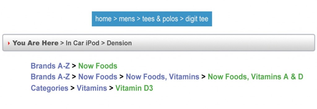 3 Example Product Breadcrumbs from Various Successful Websites
Checkout Breadcrumbs:
Using a breadcrumb trail in your checkout process is highly recommended even if you opt not to use one for your product hierarchy. This is detailed more in section 5 entitled ‘Checkout’, further down.
The top two breadcrumb images below are positioned at the top of the checkout page. The bottom 2 images are both used on the same checkout pages. The text in bold, ‘You are Here’, sits at the top of the checkout pages and under the site main header; the small round icons sit at the bottom of the checkout pages. You can be flexible and also use one or the other, either at the top or the bottom of the page.
4 Example Checkout Breadcrumbs from Various Successful Websites
Sales Funnel – Guide Your Visitors.
If you want people to buy your products, take them by the hand from entry (entering your site), to exit (ordering a product): either explicitly tell them exactly what to do within each step, or make it so obvious and self-explanatory that nobody could miss it. This is your sales funnel. Good ecommerce websites have them. If a customer lands on your home page, then subtly guide them to your category page as fast as possible, then into your product page, and then into your checkout with as few steps and as little resistance as possible.
Website Product Hierarchy.
Ecommerce websites follow a hierarchy or tier structure, like a tree with branches. However, if you go deeper than three clicks—from the home page— before you get to a product page, you will lose visitors and Google will struggle to find your products for ranking and SEO purposes. To get it right, there are typically two popular product hierarchies used on ecommerce websites.
Recommended Ecommerce Website Tier Hierarchies:
1) 3 Tiers: 1. Home Page > 2. Category Page (or thumbnail view page) > 3. Product Page
2) 4 Tiers: 1. Home Page > 2. Category Page > 3. Subcategory Page (or thumbnail view page) > 4. Product Page
3 Tier Product Hierarchy.
If you have a DVD website for example, you would structure it like this.
Tier 1 – Home Page: The Home Page is the top tier and displays your products by category on the product menu links. When a customer clicks a product menu category (such as Comedy, Drama, Sport, etc.), they enter into the Category Page (also known as a thumbnail page).
Tier 2 – Category Page: All products within this specific category will normally be laid out on the page using a thumbnail view. This is like a preview of all of the products in this one category page using a small thumbnail image per product, maybe a small intro description, possibly price and customer review rating and a ‘view more’ or ‘learn more’ (or similar) button. When you click the thumbnail products link or image, you enter into the main product page for that particular product.
Tier 3 – Product Page: This is the product page where the customers will ‘add product to cart’ before entering the checkout. You will display main product images, description, price, add-to-cart/basket button, etc. on this page. See Element 7 for Product Page information.
4 Tier Hierarchy.
If you have a clothing website, you could structure it like this.
Tier 1 – Home Page: The Home Page is the top tier and displays the products by main category on the product menu links. When a customer clicks a product menu category (such Men, Women, Children, etc.), they enter into the Category Page.
Tier 2 – Category Page: Here the categories will display sub categories from within the main categories such as (Men’s: T-shirts, Shirts, Knitwear, etc). When a prospect then clicks a product link such as T-shirts, they enter the Sub-Category page (also known as thumbnail page).
Tier 3 – Sub Category Page: All products within this specific category will normally be laid out on the page using a thumbnail view. This is like a preview of all of the products in this one category using small thumbnail images, maybe a small intro description, possibly price and customer review rating and a ‘view more’ or ‘learn more’ (or similar) button. When you click the thumbnail products link or image, you enter into the main product page.
Tier 4 – Product Page: This is the product page where the customers will ‘add product to cart’ before entering the checkout. You will display main product images, description, price, add-to-cart/basket button, etc on this page. See Element 7 in the following pages for Product Page information.
The example below shows a 3 Tier Ecommerce Product Hierarchy…
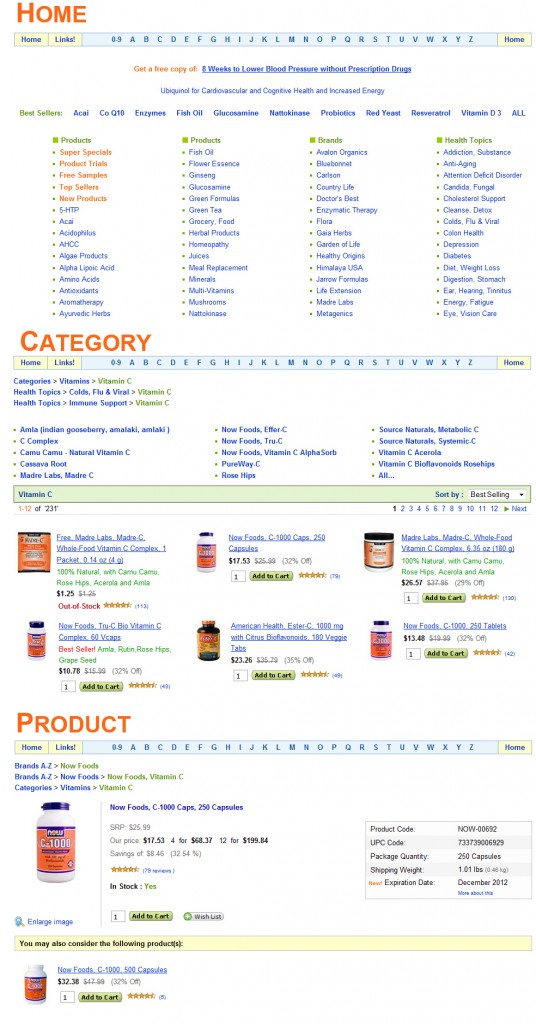
3 Tier Product Hierarchy Example from iHerb.com
Sort Feature.
It is critical within the sales funnel process to offer usability options to your prospects and existing customers, but you must make it seamless. Category (Thumbnail pages) must provide various sort-filtering options that could include:
- Sort by Type
- Sort by Price
- Sort By Color, Brand or other specific
- Sort by Date Newest added to Site
- Sort by Best Selling
- Sort by Amount in Alphabetical Order
- Ability to ‘Ascend & Descend’ all of these options
- View Quantity of Items Per Page’
‘Sort By: Type, Price, Date, Amount, Alphabetical Order’: this enables customers to quickly find the product they want—then you can get them into the product page so they can place an order.
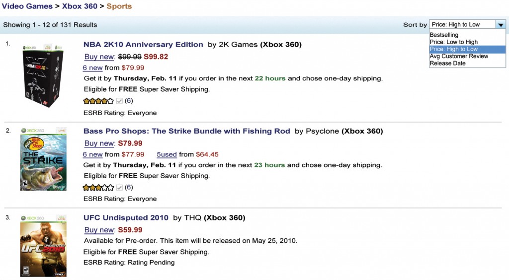
Thumbnail View Category Page with Sort Feature Showing Various Options
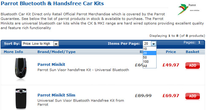
Thumbnail View Category Page with Sort By, View Items Per Page & SEO Content above
Two Popular Shopping Cart Processes.
When customers ‘Add to Cart’, there are two common methods used by ecommerce websites. It is important to test each before selecting a model to follow. We’ll discuss more on this testing (Split Testing) in Step 4.
Standard Cart Process: When a customer adds a product that they want to buy to their cart, they are automatically taken to the Shopping Cart page (as the image below shows). From here they can click ‘Continue Shopping’ that will take them either back to the product page they have come from or to the home page (this simply depends on how you set the site up). Alternatively, your customer can click the ‘Checkout’ button and place the order on the Cart/Basket page.
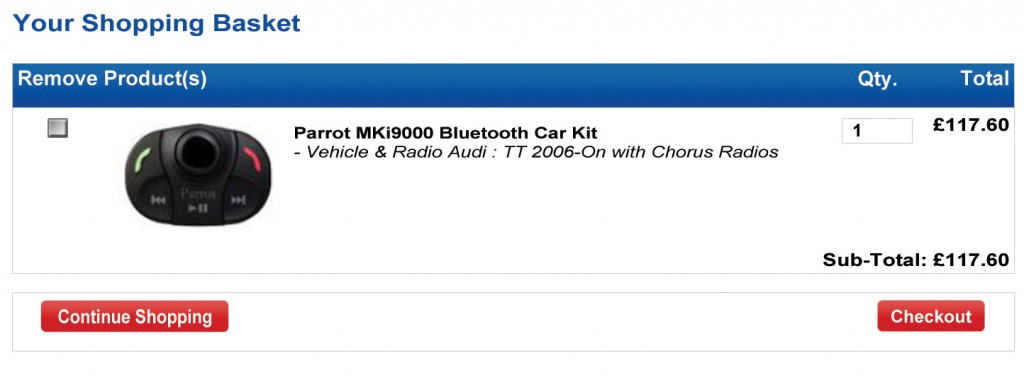
Traditional & Standard Shopping Cart/Basket Page
New Cart Process: When your prospect ‘adds product to cart’ they stay on the product page. They are then presented with a confirmation (pop up) displaying the cart activity. They are not automatically taken to the cart page as in the Standard Cart Process. The cart page still exists, but you only go there if you click the ‘View Cart’ or ‘Basket’ link.
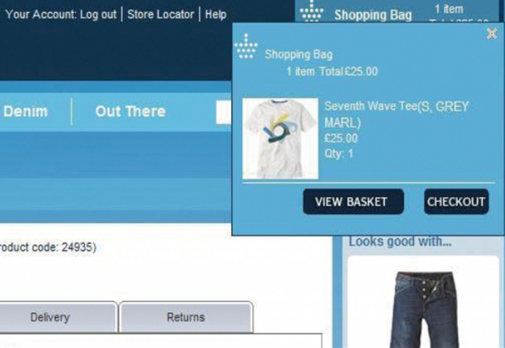
New Type Shopping Cart/Basket Page


