Newsletters.
When a visitor leaves your website, then as a minimum you want them to have signed up to your newsletter or subscribed to your RSS feed or even clicked an Adsense link making you money on the ‘exit click’. Having them place an order is obviously the goal, but with only .07 in every 100 visitors buying, we have a large number of visitors where we still need to capture their email address before they leave. Once we have the email address we can communicate with them often and offer advice, information and then products.
To get people to opt-in to your email newsletter you can give incentives like a discount code (money off voucher), a free report, how-to guide or even a free video. When you have built a rapport with them, offer them products.
Opt-in Form.
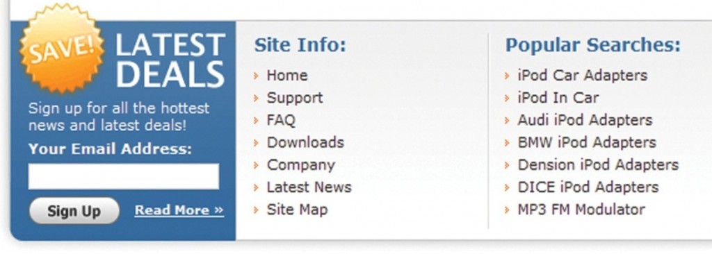
The opt-in form is normally positioned in the left or right hand column, in the footer or on a specific page, such as the contact and order confirmation page. It can also be presented in a Pop-Up or Pop-Under box that appears when your site visitor enters or exits your website.
 Email Newsletter Opt-in Box Example in Footer of Website
A pop-up box appears on top of your open window and a pop-under box or advert appears underneath their open window.
I like to test these on an ecommerce store and place the opt-in form in the left or right column, on the order confirmation page and I like to test it on ‘Exit’ not entry. When a visitor is leaving your website, this is the ideal time to hit them with a pop-up box with a compelling headline and incentive. The customer is already leaving so you have nothing to lose at this point. However, this needs testing, as some pop-up software can be a bit aggressive and even ugly.
Example Opt-in Box Text for an Ecommerce Website Selling Guitars:
Wait! Grab a free discount code now, good for 10% off any product on GuitarsOnline store. Plus, we’ll send you a free exclusive report ‘Learn to play the guitar like a pro!’ FREE in the next 60 seconds.

