When selecting a designer or design team—see Step (3) for hiring tips—it is important to be aware that not all web designers are equal. Choose the right designer and watch your profits soar. Choose the wrong designer and experience 6–18 months or more of sheer frustration, just waiting for your new website to be built and launched.
Your website design is the main element in determining if visitors will stay or leave. On entering your website you will have 5–7 seconds to hold your visitors’ attention or they will ‘bounce’ and will be gone forever ‘CLICK’. So help your visitor make the ‘should I stay or leave’
Alignment.subconscious decision into a positive ‘I want to stay’ emotional experience by following these guidelines below.
Absolutely use Cascading Style Sheets (CSS) for the navigation and site templates. This means that any changes such as color or menus can be implemented and updated across the whole site in seconds, without the need to update every page individually.
Use clean lines and boxes with straight or round edges, and group items such as text or images in small boxes or small blocks on the web page for easy scanning. Use small text headlines for each block—if appropriate—so the eye can easily scan your site pages without getting confused with one big splash of information, with too many links and options. When a visitor is reading or viewing your website they are using ‘Foveal Vision’, which is the small area you focus on at any one time. So grouping items as above is perfect for quick scanning of your pages and data assimilation.
Colors.
Use a design and color scheme appropriate to your brand and positioning. If you sell eco friendly products then you will look at using green colors and if you sell bathroom products, use blues. As a foundation to these colors use a white background—lots of white space—so your text is clear and your images are easy to see and have visual impact. Think Google’s design philosophy and simplicity. This contributed to its rapid success as a search engine.
A clean, almost neutral design, with one or two accent colors works very well for most ecommerce websites. Look at Amazon.com and Cruthfield.com for good examples. And remember: people are there to buy your products, not admire your fancy graphics, so let your products do the work.
Use Your Color Choices Wisely:
– Blue – Blue is often associated with depth and stability. It automatically evokes emotions of trust, security, intelligence, peace, and loyalty in people. Blue is the color of the ocean and the sky and is proven to work well when promoting air and sky products (airlines, air conditioning units, fans, air filters and water and sea products (cruise vacations, water filters, boats, bottled water, etc).
On the other hand, avoid blue when promoting food and cooking products. Blue suppresses the appetite.
– Black – Power, class, seriousness, drama, sophistication, and boldness (works well for prestigious products)
– White – Purity, peace, cleanliness, freshness (works well for medical products and weight loss products)
– Purple – Sophistication, royalty, mystery, spirituality (works well for yoga products)
– Green – Freshness, safety, growth, vitality, calmness, prestige (works well for drugs, health and wellbeing, medical products, natural products and eco-friendly products – use darker green for financial or make money products)
– Orange – is used to evoke enthusiasm, fascination, happiness, creativity, determination, attraction, success (works well for toys and puzzles.)
– Red – is often associated with passion, desire, war, danger, strength, power, and love (red works well in the dating and seduction niches, and it also works well with products such as energy drinks, automobiles, and items related to sports and action)
– Yellow – is an attention getter, which is the reason taxis are painted this color. When over-used, yellow can have a disturbing effect. Tests show that babies cry more in yellow rooms. Yellow is seen before other colors when placed against black, which is why this combination is often used to issue warnings.
Men tend to see yellow as a lighthearted, ‘childish’ color, so it is not recommended to use yellow when selling prestigious, expensive products to men. This explains why you very rarely see Yellow in high-end watch advertisements, or advertisements for expensive cars.
Buttons & Internal Links.
Websites and the web itself is just one big network of links. All pages on a website are connected by button, graphic or text links. So think carefully about the shape, color and wording on your button links, as different emotional responses are evoked. Test this using Google Analytics and Split Testing—detailed in Element 15 and Step 4—to see if visitors actually click them or ignore them. If you use graphic links, accompany these with a text link where possible. For optimum SEO use keywords or key phrases—again where possible—in the internal link (anchor text) on your website.
Graphics & Images.
For that initial ‘hook’, use stunning and professional images and graphics where possible. Your website graphics will blend nicely with your website design and text. Do not use too many graphics and again let your product descriptions do the selling once the visuals have evoked an emotional response.
Speak with your product suppliers to get good product images, as they may have already had these created by professionals for brochures, etc. Images can graphically paint the emotional result that your product gives to your prospect, and really entice them to feel the experience they will get by owning your product.
Also use Alt Text on your images, so if the image does not load—or is slow to load—your visitor knows what is supposed to be there in the blank space. You can set-up your ecommerce system to automatically extract the alt text information, from your product Name Field and display this with each image—for ultimate automation.
Image Type.
- Homepage Images: Do not use too many images here, just enough to get your prospect hooked and into your deeper category and product pages. If you have a lot of content—for SEO purposes—then more images may be required to balance out the copy.
- Thumbnails: these are the smaller preview type images and are good to use on the product category pages, detailing the products in this particular category—or naturally the ‘thumbnail’ page, if you are using a thumbnail page. Also used on the product page as related images, so when you click or hover on these, they appear bigger in place of the main image or in a new window.
- Main Product Image: Use the highest quality image you can find (while still displaying correctly in customers’ browsers), as this is crucial for evoking positive ‘I want this product now’ emotions and experiences in your prospects mind that initiates an immediate buying response.
- View Larger Image: Great so your prospect can see your product in closer detail. Typically opens in a new or pop up window. It’s essential to have a clearly worded ‘Close’ or ‘Close Box’ link in this window, so your visitor can click it and close the window, and get back to buying your product.
- Magnify (Zoom) Image: Allows your site visitor to zoom in on any area of the product—ideal for clothing. Only use a good and fully tested magnify/zoom module—as many you see on websites are often flakey—and only add more resistance when they fail to work properly.
Logo & Branding.
Use a professional and easy to read logo, with pertinent colors and font styles for your business positioning. Look at the elite and successful companies in the world and you will see how clean and simple their logos are; such as Amazon, Dell or Walmart. Place your logo, top left of your website in the header, and think about a short tagline underneath using keyword rich text so Google can read and index it for SEO purposes.
Load Speed & Headlines.
If your web developer can do this, load the center of your website first where your headline and intro text sits. This center area is the ‘Center Container’, and it loads faster than the main site template (Header, Footer, and Side Columns). By loading your center container and text headline first, it will capture your visitor’s attention, especially if it’s benefit-oriented as in the following example:
‘iPods, MP3 Players & MP3 Accessories all at Exclusive Prices and Delivered to Your Door FREE, in 1-3 Working Days’.
This makes your website ‘sticky’ and encourages visitors to want to stay on your website especially if your images are slow to load, and/or if your visitor’s internet connection is slow. Images and graphics–such as your header and footer–can sometimes take up to 30 seconds to load, and if they are set to load first, but don’t, then your customer has no benefit to hold them and may leave.
People are trained to read bigger, bolder words… so make your headlines bigger and bolder. Make them red, if and where feasible, so they stand out from the rest of your text.
Give your sub-headlines and paragraph titles a bit more emphasis than your regular body copy. And use plenty of white space, so your page doesn’t look crowded. For headlines and sub-headlines, try fonts like Impact, Tahoma Bold, and Helvetica Bold.
‘Keep it simple, and create a consistent and familiar hierarchy with your content; headlines, sub headlines & descriptions on all pages.’
Description Text & Fonts.
Write descriptions that are interesting, informative and loaded with benefits. There is a debate with ecommerce websites where ‘gurus’ say it’s wrong to use long descriptions. In my experience, this belief is wrong. If your products and customers require a lot of detail, then use long copy split into sub-headlines and tables. This is great for SEO!
Use clear text on navigation buttons and on product menu lists, with a capital letter at the start of the word, and lowercase thereafter. I would definitely not use all CAPS in product menus too often, as CAPS ARE HARDER TO READ than a Capital Letter Plus Lowercase. Nor would I recommend using just lowercase throughout the buttons and links—unless that is your theme and it fits.
Easy to Scan.
Layout your text descriptions so your pages can be scanned quickly, from top to bottom. The use of a main headline, sub headlines and splitting areas of your content into headers or tables with headers such as Description, Features/Spec and Technical, going down the page, allows for quick scanning.
Use a clean font style appropriate to your website, product, category and theme that is easy to read and use the appropriate font size for your user. If you are selling to an older age group, think about using a larger font or even explicitly give the option to view with larger font—as not many people know how to increase the font size in their browser.
Fonts.
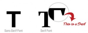
Try Sans-Serif fonts for your headlines and sub-headlines, and Serif fonts for your regular in-line body copy. Sans Serif fonts are clean and straight fonts without those little extras on the tops and bottoms of the letters. Serif fonts have the extra little embellishments.
For your regular in-line body copy, use Serif fonts. Serif fonts have been used in print for years (Magazines, Newspapers, Books) and have been proven to create higher readability. This includes fonts like Courier New, Georgia, and Times New Roman.
F-Pattern.
Eye tracking research suggests people read websites differently than books and magazines—that is, top to bottom and left to right. Instead they read a web page in an F-Shaped pattern which is in horizontal ‘sections’, and read less and less of each line as they read down the left side. So position your important site elements, such as product menus and site navigations at the top and on the left hand side.
Marketing & Promotional Elements.
Use these to promote your special offers, best sellers, email newsletter opt-in, technical info, trade info, security info, etc. You can position them on the main navigation bars as regular links, in the center container on the homepage or footer as on-page graphical elements, or as commonly seen in the left and right hand columns below the product menus.
Keep this information small in height, position it in square or round edge boxes, and use clean colors that are subtle and not too overpowering. Let your main site navigation and features control the website sales funnel, and allow your marketing areas and boxes balance with the site design and be available if your site user needs them.
Main Website Table Position in Browser.
Do you position your website in the center of the page (on the screen)? To the left of the page? or do you consume the whole browser window like Amazon.com does as an example? This really is personal preference and there is no right or wrong table positioning.
Consider these Points for Your Site Table Positioning:
1) Consider the screen resolution size used by your customers, so it balances well on screen.
2) The amount of products your website sells and the number of services you are promoting. If these two are massive like an Amazon.com, then utilizing the full screen is recommended, so you have enough room to promote everything. On the flip side, if it’s cluttered then it can be very detrimental to usability and conversions.
3) Length of menus and marketing / promotional boxes that you need to display in the left and right side columns such as opt-in box, security and cards, ordering, best sellers, trade service, or whatever it may be for your particular site and the services offered.
4) Your target visitor and size of font and content required. People with impaired vision may need the font larger with less clutter.
5) Carrying on from (4), do you need to focus the website on a narrower width to give the eye a cleaner and simpler area to view?
6) People read from left to right, so for a more traditional audience, a left aligned table layout may be more appropriate.
Attention to Detail.
Be detailed and specific, clean up typos and grammar. One spelling mistake can give the impression that you do not check things. If you cannot spell, or cannot be bothered to check your spelling, a customer will doubt that you can handle their credit card and personal details responsibly. These are subconscious thoughts and references that customers make.


