Conversion Optimization is a science. Using the Psychology of color, eye-tracking studies, and A/ B testing, we can determine the best possible ways to design a landing page so people will take the action you desire.
One of the key components on a landing page is the actual Call to Action button.
From the placement of the button to the color choice, this can play a major role in determining whether or not visitors are going to click and take action.
I’ve selected 5 of the best Call to Action buttons I’ve seen. We’ll talk about what makes them so persuasive.
Button Color
Is there one color that is more persuasive than another? Some might argue that orange, the color of excitement, will get more clicks. Others might say to avoid red because we associate red with “stop” or “caution.”
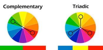
I think it is important to take color psychology into consideration when choosing your button color. But more important is the color in relation to your website.
Look at Netflix. Their branding is red. The color of caution. However, their red button matches their branding AND stands out in contrast to the other colors on the page.

Picking a contrasting color that stands out is more important than the actual color itself.

Once you’ve chosen a color for your button, make sure all other calls to action buttons on your website match. People prefer, and expect consistency.
Call to Action Text
What words convert the best? Look at our Netflix example above, and Wordstream. What do you notice about both CTA text?

The word FREE.
Free is one of the most persuasive words in marketing. Who can resist something that is free? It tells the visitor there is no risk in taking action right now. No cost to them, no loss if they don’t like the product or service.
The other important quality of these call to actions is the specific detail of the button.
People like to know what is going to happen when they submit their valuable information or spend their valuable time to click your button.
Netflix tells visitors to “Join Free for a Month”. Wordstream might not be able to offer a free trial, so instead, they are offering a free report. “Get Your FREE Report Today”. Notice how they are telling you what you’re getting, and that you can get it today.
Immediacy is another very persuasive concept. Words like Now or Immediately are among the topmost persuasive words in marketing.
Use persuasive words in your text, and be as detailed as possible.
Button Location
Look at this example of Campaign Monitor. Notice the word free, the bright green contrasting color. And what else?

The button is centered in the middle of the visitor’s field of vision. You can’t miss it.
Now, look at this example from HotJar.

Notice how it uses all the same concepts, including the central location of the button on the page.
You want your CTA to be the central focus of your visitors. According to eye-tracking studies, visitors automatically look to the center of the page when they first land on your site, before their eyes move up to the top left corner. Putting that call to action right in the middle is going to guarantee their eyes will be on it.
Font Type and Color

This example of Hubspot again uses all the concepts: Persuasive words (FREE), details of what happens when a user clicks, an eye-catching, contrasting color, and a central location of the button.
Notice something else in all the text? The font is simple, bold, and in most cases, all capital letters.
The most important thing here is readability. The button text should be easy to read and rather than trying to convey emotion, it should be a clear statement of the action they should take.
Button Size
The size of the button matters. Don’t make it too big or you’ll come across as pushy or overwhelming. Make it too small, and the visitors will miss it altogether or find it annoying to click on a mobile device.
Make the button proportional to the surrounding text and design. This also means to keep your button’s text appropriate in length.
Conclusion
Button text should be persuasive and descriptive of what will happen when a user takes action.
The button color must complement your color scheme and contrast other colors on the page so it stands out. Then be consistent with your CTA buttons throughout your website.
Position the button in a central location so it won’t be missed and the eye naturally lands on it.
Keep the font on your button easy to read.
The button should be an appropriate size, not to overwhelm the user but to clearly indicate the action to take.
How do your call to action buttons stack up? Have you noticed any great CTAs around the web? Tell me about it!

