Ecommerce Checkout. Ecommerce Cart. Ecommerce Conversions.
Continuing from ‘Conversion’, a short and smooth checkout process is crucial for maximizing orders. As we now know, Cart Abandonment is a huge problem for ecommerce websites. The need to eliminate checkout resistance and consequently reduce cart abandonment rates is of prime importance, and this alone can mean the difference between an extra $10K and $100K plus in sales per month.
Reduce Checkout Resistance.
We need a fast checkout process that is seamless with as few as steps as possible and little or no resistance. It has to be clean and simple with no distractions, so I recommend removing your left and right menus—just like Amazon do—and keep the text to a minimum and make it very succinct with clear and basic instructions of what you want the customer to do.
Amazon actually go one step further and remove the header navigation too with only a small ‘Go to the Amazon.com home page (without completing your order)’ link at the bottom of their final Order Review page. This is taking their checkout process to the next level; its laser focused but could be one step too far for a small business ecommerce website. Run tests and you will know which is best.
Display help notifications on small pop-ups—visible when a would-be customer makes the cursor hover over an ‘info link’—where required, assisting your shoppers so the whole checkout process is seamless and self-explanatory. Any detailed ‘how to order guides’ will go in your help or customer support area. Your prospects are emotionally charged during a checkout phase and are not thinking logically, so do not make them think too much or your sale could be lost.
In summary: During the checkout process do not give prospects too many options and definitely do NOT give them a checkout degree course!
Checkout Breadcrumbs:
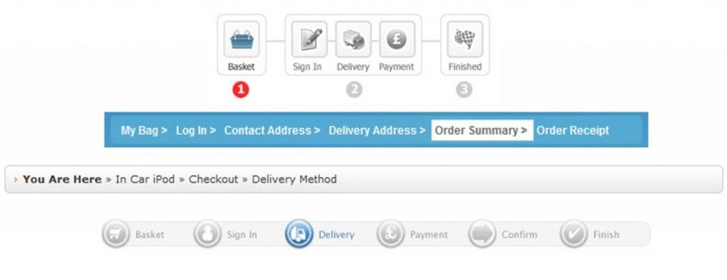
Using a breadcrumb trail in your checkout process is important as it shows your prospects exactly where they are in the checkout process and how many steps are left to order completion. This guide is by way of links, small image icons or both and can help reduce cart and checkout abandonments.
3 Checkout Breadcrumb Examples
Checkout Page Security Requisites.
Display clear yet subtle security and credit card logos, and maybe a small padlock or security image in the checkout process. These will build trust and familiarity. You will need a secure checkout—this is mandatory—and your web developer or hosting company will provide the Secure Socket Layer (SSL). See an example verification image below of an SSL enabled website.
Using an SSL will 100% secure your website checkout area and an ‘s’ will appear in your domain name (as in ‘https://…’, instead of just ‘http://…’) when in the checkout. In addition, an image of a padlock will appear in your visitors’ browser.
Note: You should NOT make the whole website secure, as it will slow the load speed down massively and is unnecessary. Only secure your checkout.
Unsecure and Secure URL’s
Example of a Secure Socket Layer (SSL) Enabled Website, Displaying SSL Certificate
Coupon/Voucher Code Box.
If you have a Coupon or Discount Voucher Code box in your checkout area, and you are not currently running discount promotions, then disable it. Customers are fickle and easily distracted. Many will leave your checkout page and go hunting for money off coupon codes—and the problem is that many would-be-customers will never return to complete their order.
So (see section 14 ‘Marketing Elements’) get your web developer to add the facility to disable this box from the back-end admin, as and when required. If you are not running any coupon code / money-off promotions then turn the box off in the checkout: make it disappear until you need it.
Example Discount Coupon/Voucher Code Box as Found in Checkout
Create Account.
Another potential problem is if you ask people to ‘sign up’ or ‘create account’ in your checkout area: this can greatly increase cart abandonment rates. The majority of people do not like to sign up or create an account when buying. Therefore, you can subtly word this so that your prospects believe they are simply ‘entering their billing/shipping details’ and this eliminates the enemy of resistance. Your prospect is actually creating an account by giving you their details, but you do not need to advertise the fact. Larger and more reputable companies such as Amazon—having more brand awareness—can explicitly ask you to create an account with fewer cart dropouts.
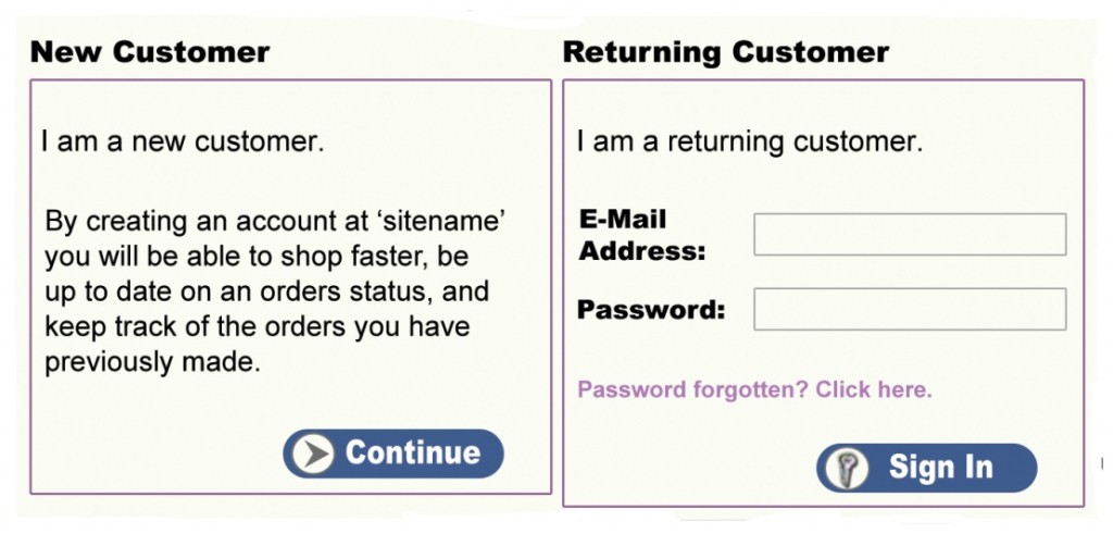
An Average ‘Create Account’ Form – This is how NOT to word your Checkout Account Set-up Process
Amazon.com Express Checkout.
Amazon.com has recently launched ‘Pay Phrase’, a simple way to verify your account to speed up purchasing. You set up a unique phrase like ‘Web Warrior’ and select a 4-digit PIN. This is linked to your Amazon account, which is pre-loaded with your credit card and shipping address. Whether it actually speeds up purchasing though, is another question.
Setting Up Checkout Funnel Goals to Monitor Cart Abandonment.
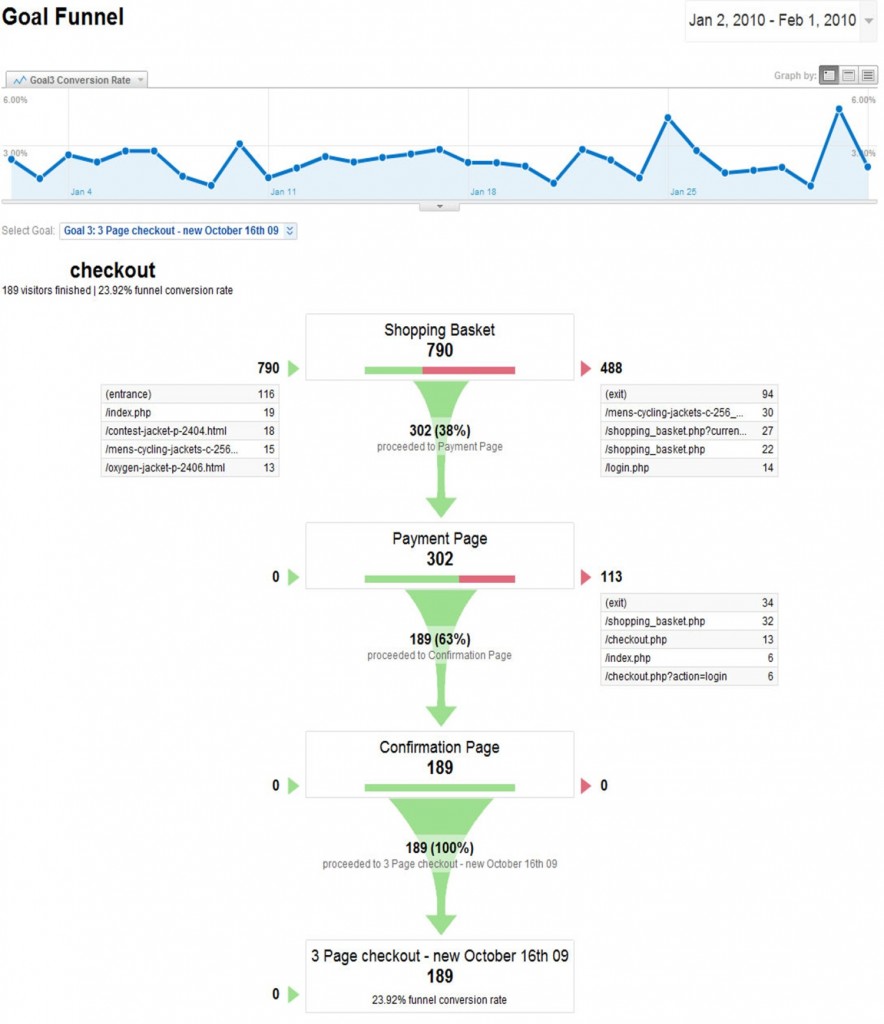
Many website checkout areas and processes are too complex, time consuming and have up to seven different pages. If you monitor your website stats—by setting up Goals in Google’s free Analytics software—you will see where people drop out and at which step in the checkout process.
Example of Checkout using Google Analytics Goals and showing Cart/Basket Abandonment Rates at Each Stage of the Checkout Process
What Creates Checkout Resistance?
- Slow loading speed
- Too many steps, too many pages, too many options, too many distractions
- Too confusing or too busy
- Using the words ‘Create Account’ can be a problem depending on product and customer type
- Broken forms or fields (needs testing in different browsers and platforms such as IE, Firefox, Safari, Windows & Apple Mac)
- Discount Code Box Can entice potential customers to leave the site to look for discount codes
- Not secure (lack of SSL certificate, no ‘s’ in the https in URL/Web Address & no padlock symbol in browser)
- Poor trust due to no visible security logos or accreditations such as MasterCard, Visa, PayPal, Bank Logos, Shopping Safe accreditations like BBB (US), McAfee Secure or FSB & ISIS in the UK
- Button color, shape & wording
Cart & Checkout Buttons.
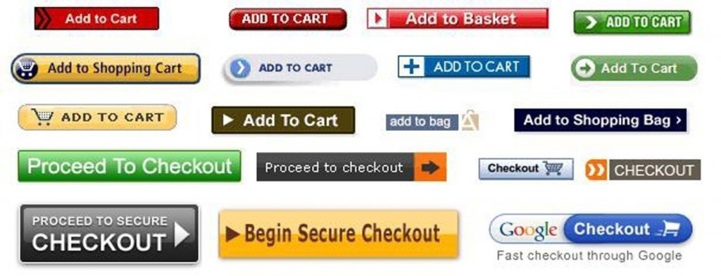
The color, shape and wording used on buttons can play a huge part in conversion rates. Imagine a big square-edged button, saying ‘BUY NOW’ in a bright red color. Contrast this with a round edged button, in blue saying ‘Add to Cart’. In testing, you will find different emotional responses evoked between the two buttons, affecting sales. This is not only about button characteristics but also depends on your product and positioning, so use appropriate button elements. Not only in your product, cart and checkout pages, but site-wide as well, consider your button shape, color and wording.
Random Cart & Checkout buttons. What Emotions do These Evoke in You?
‘Stop checkout resistance and massively reduce shopping cart/basket abandonment rates… Revolutionary 1 page checkout can Increase sales & profits by up to 400% overnight!’
The 1–Page Checkout Model.
In 2005 my team and I spent a lot of time analyzing the checkout process on my websites, monitoring the cart-abandonment rates and testing various checkout set-ups, using split testing and multivariate testing. This is the process of using two or more different checkout concepts and modifying on-page elements, randomly showing each one to customers and measuring the results. You then select the best performing setup, modify further until you reach your desired conversion rate, and then use it permanently on the live site. Incidentally, this can be applied to almost any area of your website, from buttons to pages—more on split and multivariate testing in Step 4.
As a result, we designed and built a pioneering 1–page checkout. This new and exclusive checkout page immediately follows the cart /shopping basket page and contains all user forms on the one page in five simple steps. I have various different layouts on this model and all undergo thorough testing to ensure they improve conversion rates before permanent use on the live site.
Will this Checkout Format Improve Conversions on all Websites?
The simple answer is that you need to test! Using a 1–page checkout is definitely not mandatory, but testing is. In a perfect scenario, you would run split testing on your normal checkout versus the new one page checkout and measure the results. Split testing would serve up both checkouts randomly and you pick the one that converts more sales.
The 1 Page Checkout Form & 5 Simple Step Process for Customer:
1) Step 1: Billing Details
2) Step 2: Shipping Details
3) Step 3: Shipping Option
4) Step 4: Payment Method
5) Step 5: Create Password
6) Order Preview Box with simple overview of the items being paid for
7) Click ‘Confirm Order’ Button
Note: The text at the side of password in brackets disguises a ‘sign up to account’ process. It says something like “A password allows you to view your orders, print invoices, and make address changes, action returns and place future orders faster”.
Each step on the checkout page is accompanied by a small ‘Info’ link, which gives you a small pop up with information assistance when you hover over it.
Note: For reference, I detailed the ‘Create Password’ text above as people get suspicious about creating accounts and passwords as discussed earlier.
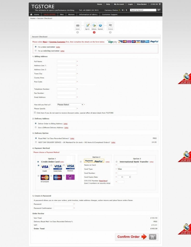
Design Example of a Seamless 1 Page Checkout (taken from many design variants)
Order Confirmation Page.
Once an order has been placed on your website, your customer will be presented with the ‘Order Confirmation Page’ (also known as Order Success Page).This mainly says ‘Thanks for your order!’ However, this page can be greatly improved and utilized for much more.
When a customer has just ordered they have endorphins rushing around their bodies. This is the ideal opportunity to offer them something else, as they are highly responsive.
Order Confirmation Page Tips:
- Say ‘Thank you’ to your customer. Explain their invoice will be emailed to them and give expected shipping times and that multiple items may be delivered at separate times if one is out of stock
- Ask them to check their Spam folder if they fail to receive your email invoice. This will cut down on support requests.
- You can offer a Newsletter Sign Up or RSS
- If you have multiple websites, place banners or links to your other websites here
- Offer related and recommended products
- Place Google Adsense (to make money on the exit click)
- Promote other peoples products and services (affiliate links) where available
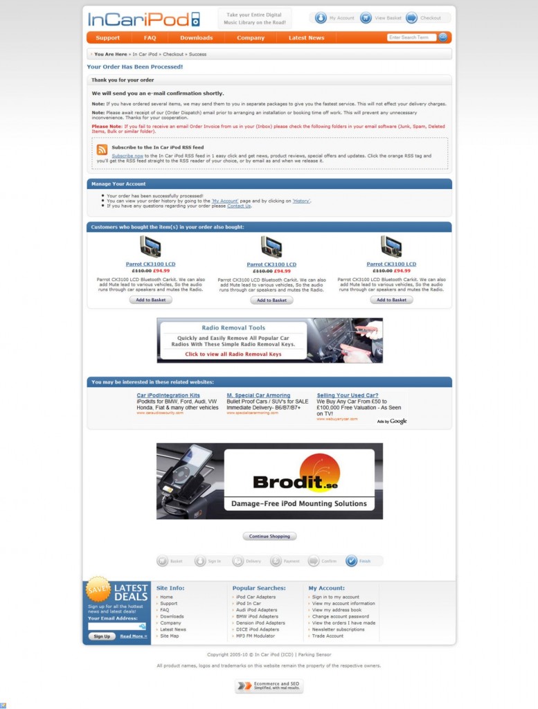
Example 1: Order Confirmation Page (screen shot below) using these features:
1) Thanks for Your Order message
Thank you for your order!
We will send you an e-mail confirmation shortly.
Note: If you have ordered several items, we may send them to you in separate packages to give you the fastest service. This will not affect your shipping charges.
Note: Please await receipt of our Order Dispatch email prior to arranging an installation or booking time off work. This will prevent any unnecessary inconvenience. Thanks for your cooperation.
Please Note: If you fail to receive an email Order Invoice from us in your Inbox, please check the following folders in your email software: Junk, Spam, Deleted Items, Bulk or similar folders.
2) Manage Your Account links
3) Banners promoting related websites
4) Email newsletter opt-in
5) Continue Shopping Button linking to Home Page
6) Customer Survey
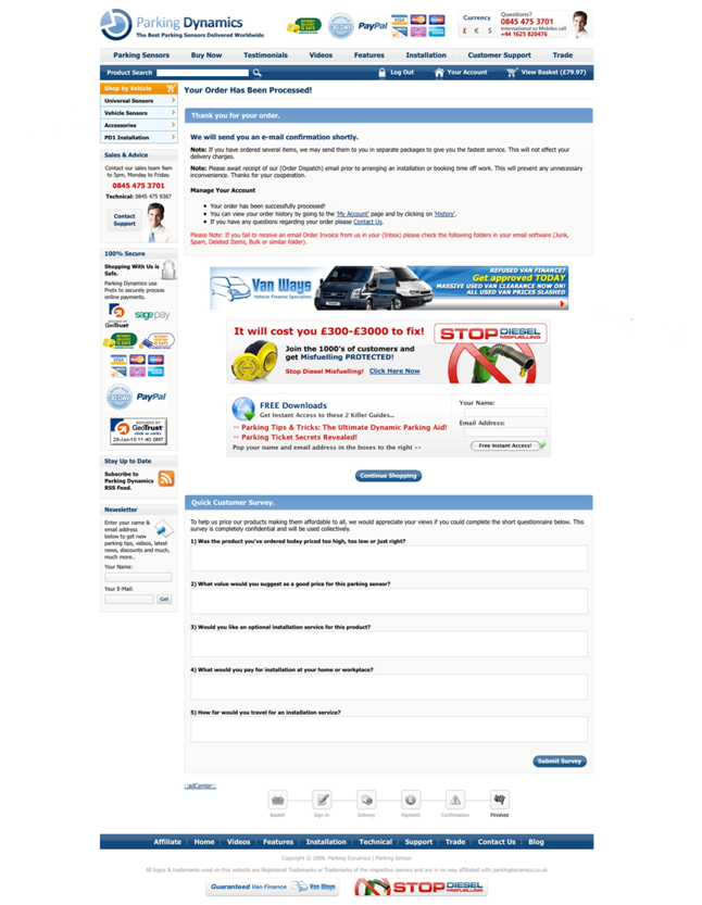
Example 1: Order Confirmation Page
Example 2: Order Confirmation Page (screen shot below) using these features:
1) Thanks for Your Order message
Thank you for your order!
We will send you an e-mail confirmation shortly.
Note: If you have ordered several items, we may send them to you in separate packages to give you the fastest service. This will not affect your shipping charges.
Note: Please await receipt of our Order Dispatch email prior to arranging an installation or booking time off work. This will prevent any unnecessary inconvenience. Thanks for your cooperation.
Please Note: If you fail to receive an email Order Invoice from us in your Inbox please check the following folders in your email software: Junk, Spam, Deleted Items, Bulk or similar folders.
2) RSS Subscribe Option
Subscribe to the In Car iPod RSS feed
Subscribe now to the In Car iPod RSS feed in 1 easy click and get news, product reviews, special offers and updates. Click the orange RSS tag and you’ll get the RSS feed straight to the RSS reader of your choice, or by email as and when we release it.
3) Manage Your Account links
- Your order has been successfully processed!
- You can view your order history by going to ‘My Account’ page and by clicking on ‘History’.
- If you have any questions regarding your order please ‘Contact Us’.
4) Recommended Products: Customers who bought the item(s) in your order also bought
5) Banner advertising other product or service
6) You may be interested in these related websites
7) Large Graphic Banner advertising new (cross sell) products
8) Newsletter opt-in
9) ‘Continue Shopping’ button that takes them back to Home Page
10) Site links


